


Amplify Agency
BRAND STRATEGY / BRAND DESIGN / BRAND MESSAGING /BOOK COVER/WEBSITE ART DIRECTION
OVERVIEW
Amplify is an award winning digital marketing agency and Australia’s first audio marketing agency.
We partnered together during a pivotal time in the agency growth, working to redefine their new brand positioning as they were moving from podcast only model to a full service digital agency.
BEFORE
Brand idenity prior to undergoing rebrand

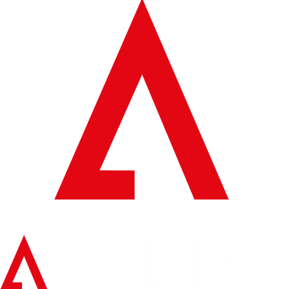
AFTER
The logo is a combination of elements incorporating letter A within an arrow moving up
indicating amplification


BRAND EXTENSION
When concepting the main logo it was essential to design a deliberate brand icon which will easily integrate into the extension of Amply brand.


COLOUR PALLET
Colour pallet is sleek and represents, strength, innovation, authenticity, industry dominance, innovation and forward thinking.
TYPOGRAPHY


BRAND PHOTOGRAPHY STYLE
inspiring / sophisticated / rich tonal dark colours / black and white / duotone photography / aspirational


Brand Launch


What happened next...


FEATURED IN


